Fira Code vs JetBrains Mono: Which Wins for Coding?
The Short Version
Both fonts are excellent. Neither is objectively better. But they make different tradeoffs, and once you understand those tradeoffs, picking the right one for your setup takes about thirty seconds.
Fira Code optimizes for expression density. JetBrains Mono optimizes for long-session readability. That single sentence covers maybe 80% of the decision.
Background
Fira Code shipped in 2015, forked from Mozilla's Fira Mono with one goal: add programming ligatures so that !=, ->, =>, and dozens of other two-character sequences render as single glyphs. It became the poster child for ligature-first coding fonts and still carries that reputation in 2026.
JetBrains Mono arrived in 2020 from the team behind IntelliJ, Rider, and WebStorm. They built it after studying thousands of lines of their own editor's rendering and asking a focused question: what actually reduces eye strain over an eight-hour session? Ligatures came along for the ride, but they were never the headline feature.
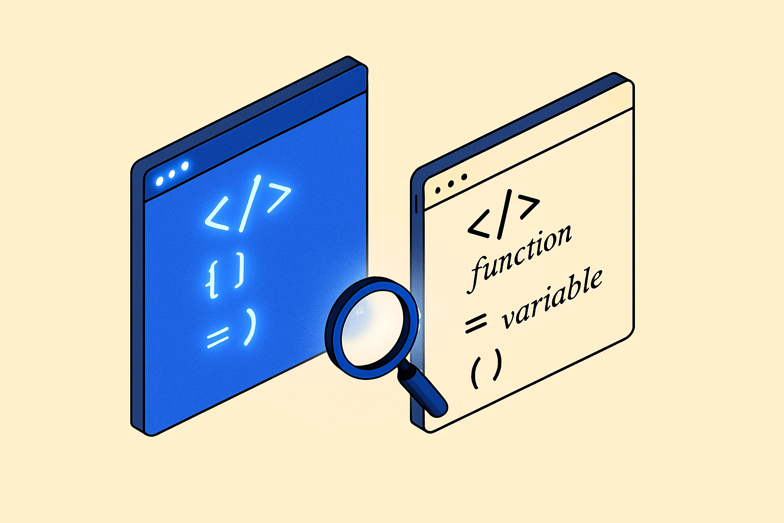
Ligatures: Where Fira Code Still Leads
Fira Code has roughly 100 ligatures. JetBrains Mono has around 150, which surprises people who assume JetBrains kept things minimal. But the character of the ligatures differs.
Fira Code's ligatures feel expressive and are tuned for aesthetics. The === triple-equals becomes a satisfying triple-bar. The fat arrow => collapses into a clean single form. If you care about code looking polished and you spend time in languages like Haskell, Elm, or functional JavaScript, Fira Code's ligature set is more carefully considered.
JetBrains Mono's ligatures are more conservative. They simplify without dramatically reshaping. If you work with a team that's split on ligatures, or you switch between ligature-on and ligature-off contexts, JetBrains Mono looks more coherent either way.
Letterform Design
This is where the fonts diverge most obviously at the glyph level.
Fira Code has slightly wider characters with open apertures. The a, e, and g are conventional double-story forms. The overall impression is warm and slightly informal.
JetBrains Mono uses a taller x-height and slightly more condensed proportions. Characters like l, 1, and I are engineered to be unambiguous, which matters more than you'd think when you're debugging a variable named ll at 11pm. The font also has increased character weight at small sizes, keeping strokes visible even at 12px on a non-retina display.
For anyone on an older monitor or working at smaller font sizes, JetBrains Mono holds up noticeably better.
Weight and Style Range
Fira Code ships in five weights: Light, Regular, Medium, SemiBold, and Bold. That covers most needs. There is no italic variant, which is a genuine limitation. Many editors use italic for comments and certain syntax tokens. With Fira Code, you either turn off italic rendering or accept that the editor's faux-italic kicks in, which looks bad.
JetBrains Mono ships in eight weights, each with a true italic. That is a real advantage for anyone who uses italic differentiation in their theme. If you use themes like Night Owl or Cobalt2 that lean heavily on italics for keywords and comments, JetBrains Mono is the correct choice, full stop.
Performance in Different Contexts
Small sizes and low-DPI screens
JetBrains Mono wins here. Its hinting is better tuned for sub-retina rendering, and the heavier stroke weight keeps characters readable. If you run an external 1080p monitor at 13 or 14px, the difference is visible.
High-DPI screens at comfortable sizes
Both fonts look excellent. At 15px or 16px on a retina display, this becomes a pure aesthetic preference. Fira Code feels slightly more spacious. JetBrains Mono feels slightly more structured.
Functional and mathematical languages
Fira Code wins. Its ligature set was built with these languages in mind. The |> pipe operator, lambda arrows, and type annotation symbols all get thoughtful treatment. If you write Elixir, Haskell, or OCaml regularly, Fira Code's ligature vocabulary fits the syntax more naturally.
Long sessions in a dark theme
JetBrains Mono wins. The increased x-height and careful stroke weight distribution reduce the visual fatigue that comes from hours of staring at light text on a dark background. This is anecdotal but consistent across enough developers that JetBrains specifically documented it as a design goal.
Teams and pair programming
JetBrains Mono wins. The disambiguation of ambiguous characters is genuinely helpful when two people are reading the same screen. The true italic variants also mean any shared editor config renders exactly as intended.
File Size and Loading
If you are serving either font on a web-based editor or an in-browser IDE, file size matters. Both fonts are available in variable and static formats. Fira Code's full variable font file is smaller because it covers fewer axes. JetBrains Mono's variable font is slightly heavier but gives you the full weight and italic range.
For desktop editors, this distinction is irrelevant. For web apps, load only the weights you actually use and subset aggressively.
The Quick Rundown
- Fira Code: best for ligature-forward workflows, functional languages, aesthetic-first setups, and developers who prefer slightly wider letterforms.
- JetBrains Mono: best for long sessions, low-DPI screens, teams, italic-heavy themes, and anyone who values disambiguation over decoration.
- No italic needed: Fira Code is fine.
- Italic-heavy theme (Night Owl, Cobalt2, etc.): JetBrains Mono is the correct pick.
- Haskell, Elm, functional JS: Fira Code.
- Eight-hour daily driver: JetBrains Mono.
Final Take
Fira Code is the font that made programming ligatures mainstream and it still earns its reputation. JetBrains Mono is the font that looked at what coding actually demands over a full workday and designed toward that. They are both free, both well-maintained, and both worth having installed.
Try each one for a full week before deciding. The first two days of any new coding font are dominated by novelty, which distorts the judgment. Day five is when you know.
Frequently asked
Can I use Fira Code and JetBrains Mono together in the same project?
Technically yes, but there is no real reason to. Each font is a complete system. Mixing them in a single editor config produces visual inconsistency without any benefit. Pick one per environment.
Does JetBrains Mono only work well in JetBrains IDEs?
No. JetBrains Mono is a standard OpenType font that works in VS Code, Neovim, Zed, Sublime Text, and any other editor that supports custom fonts. The name reflects who made it, not where it runs.
Should I turn on ligatures for JetBrains Mono?
It depends on your preference. JetBrains Mono looks coherent with ligatures off, unlike some fonts that feel incomplete without them. Start with ligatures off for a week, then try them on. JetBrains Mono is one of the few fonts where either choice is defensible.
Which font is better for streaming or screen recording?
JetBrains Mono. Its heavier strokes and larger x-height survive video compression and lower-resolution stream output better than Fira Code's slightly lighter forms. Viewers on 1080p streams will read your code more easily.
Are there newer fonts in 2026 that beat both options?
Several newer monospace fonts have appeared, but Fira Code and JetBrains Mono remain the most battle-tested and widely supported options. They both receive active maintenance, which matters for coverage of new Unicode characters and emoji that appear in modern codebases.