Variable Fonts vs Static Fonts: Which Should You Use?
The Core Difference
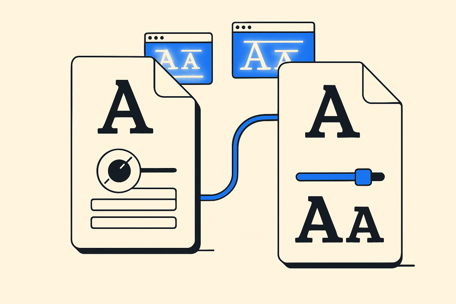
A static font file encodes one specific combination of weight, width, and style. Bold is one file. Regular is another. Italic bold is a third. A variable font collapses all of those into a single file, with continuous axes that you can dial to any value in between.
That sounds like an obvious win for variable fonts. It mostly is, but the tradeoff is more nuanced than the marketing makes it seem.
How Variable Fonts Actually Work
Variable fonts use the OpenType variations spec. Each axis, weight (wght), width (wdth), optical size (opsz), and any custom axes the designer added, is a continuous range. The browser interpolates outlines between defined masters.
In CSS you access them through font-variation-settings or, for registered axes, through the normal properties you already use. font-weight: 450 just works in a variable font. In a static font it snaps to the nearest available weight.
The interpolation happens on the GPU in modern browsers, so animation is cheap. You can tween a heading's weight on scroll without touching a JavaScript animation library.
The File Size Question
Here is where developers get confused. A single variable font file is larger than a single static file. A variable wght font might be 120 KB where the Regular static cut is 25 KB.
But the comparison that matters is the variable font versus every static weight you would have loaded anyway. If your design uses Regular, Medium, Semibold, and Bold, that is four HTTP requests and roughly 100 KB of static files, depending on the family. One variable file at 120 KB with one request wins on both counts.
The breakeven point is around two or three weights. Load only one weight? Stick with static. Load three or more? Variable almost always wins.
Subsetting Changes the Math
Font compression and subsetting shift the comparison further. A subsetted variable font that covers only Latin characters and the axes you actually use can drop to 40-60 KB. A subsetted static file for one weight might be 15 KB. The variable advantage shrinks if you are truly serving a minimal subset, but the single-request benefit remains.
If you are not subsetting, you are leaving performance on the table regardless of which format you choose.
When Static Fonts Still Win
Static fonts are not obsolete. A few real scenarios where they make sense:
- You need one weight only, and the family does not have useful axes beyond weight.
- You are targeting older browsers or environments like some PDF renderers and native apps that do not support OpenType variations.
- The specific variable font file is poorly optimized and the static cuts are tighter.
- You are using a font that simply does not have a variable version in the library you are pulling from.
Old Android WebViews (pre-Chromium) and Internet Explorer do not support variable fonts at all. If your analytics show meaningful traffic from those environments, you need a static fallback or a static-only approach.
Font Picks for Each Case
Go Variable: Roboto Flex
Roboto Flex is one of the most axis-rich variable fonts available. It ships with twelve registered and custom axes covering weight, width, optical size, grade, and more. If you are building a design system where UI density or reading conditions vary across breakpoints, this is the font that makes variable worth the investment. The optical size axis alone, adjusting stroke contrast for small versus large text, justifies using it over static alternatives.
Go Variable: Fraunces
Fraunces is a display serif with a softness axis (SOFT) and wonk axis (WONK) that have no static equivalent. You cannot approximate what SOFT does with a static file because the intermediate states simply do not exist. Variable is the only option if you want what makes Fraunces interesting.
Go Variable or Static: Inter
Inter is available in both forms. The variable version is well-optimized. For a typical product UI loading two to three weights, the variable file saves a request and a little bandwidth. For a landing page loading only Regular and Bold, the static cuts are fine and marginally lighter. Inter does not have exotic axes, so the functional case for variable is purely about file consolidation rather than unique capabilities.
Go Variable: Geist
Geist ships as a variable font by default. It is designed for developer-facing interfaces and technical content, and the weight axis is smooth enough that you can run it from thin to black without artifacts. If you are building a docs site or dashboard, Geist variable handles the full weight range in one file cleanly.
Implementation Notes
Declare variable fonts in @font-face with a range for the font-weight descriptor, not a single value. font-weight: 100 900 tells the browser this file covers the whole axis. Without that, the browser may not use the variable capabilities correctly.
Always pair with font-display: swap or optional depending on how critical the font is to layout stability. Variable fonts load as one file, so the swap moment is a single event rather than staggered per-weight flashes.
For animation, prefer font-variation-settings over animating font-weight directly. Browser support for animating variation settings is broader and the performance characteristics are more predictable.
The Bottom Line
Variable fonts win when your design uses multiple weights or styles, or when you need axes that have no static equivalent. Static fonts are still the right call when you are loading a single weight, targeting legacy environments, or working with a family that has tighter static cuts. The format is a tool, not a philosophy.
Frequently asked
Do all modern browsers support variable fonts?
Yes. Chrome, Firefox, Safari, and Edge have all supported variable fonts since 2018. The only environments that require a static fallback are Internet Explorer and some older Android WebViews based on the stock browser rather than Chromium.
Can I use a variable font and still specify exact weights like 400 or 700?
Yes. Variable fonts respond to standard font-weight values. Setting font-weight: 700 on a variable font that includes a wght axis works exactly as expected. You also gain the ability to use non-standard values like font-weight: 550 that static fonts cannot render.
Does using a variable font affect how I subset the file?
The process is the same but you need to be careful not to strip variation data when subsetting. Tools like fonttools and the pyftsubset command support variable fonts, but you must pass the --no-hinting flag carefully and avoid dropping the gvar or CFF2 tables that carry the variation information.
Are variable fonts heavier for users who only need one language?
Not necessarily. A subsetted variable font covering only Latin characters is typically 40-70 KB depending on the family and number of axes. That is comparable to two or three static subsets, so if your design uses multiple weights you still come out ahead.
Can I animate font weight smoothly with a variable font on scroll?
Yes. Animating font-variation-settings in CSS or via the Web Animations API is GPU-accelerated in Chromium and Firefox. Keep the animation on the compositor thread by avoiding properties that trigger layout alongside the font animation, and the effect stays smooth at 60 fps.