Best Free Monospace Fonts for Code and Design
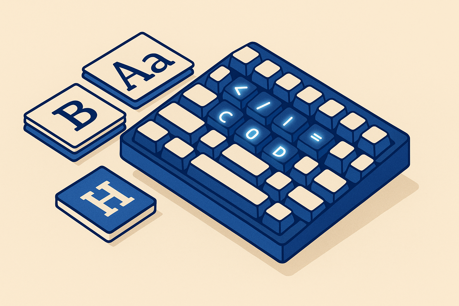
Monospace fonts are one of those categories where the wrong pick genuinely costs you. Eye strain compounds over eight hours. Ligature support that works in one editor breaks in another. A font that looks great in marketing mockups turns unreadable at 11px in a terminal. So instead of listing every decent option and calling it a day, this post focuses on ten fonts that are actually free, widely available, and worth your time, with a clear case for each one.
The Workhorses: Best for Daily Coding
JetBrains Mono
JetBrains Mono is the default choice for most developers in 2026, and the reason is simple: it was designed by people who spend their careers staring at code. The letterforms have increased height for lowercase letters, which gives you better readability at small sizes without bumping up your font size. Ligatures are extensive and well-implemented, and the weight range is wide enough to work in bold-heavy themes without everything collapsing into visual noise. If you have no other preference, start here.
Fira Code
Fira Code is the font that put programming ligatures on the map. The ligatures for operators like !=, =>, and <= are still among the best implemented anywhere. It is slightly narrower than JetBrains Mono, which suits developers who want more code visible per line. The downside is that development on the project has slowed, but the font itself is stable and the hinting is excellent across platforms.
Source Code Pro
Source Code Pro is the quiet professional. Adobe designed it as a companion to Source Sans, and it shows. The spacing is conservative, the weight range is serious (nine weights), and it is one of the cleanest options for environments where ligatures are disabled or unsupported. It handles non-Latin characters better than most free options, which matters if your codebase has internationalized strings.
Corporate-Backed and Credible
IBM Plex Mono
IBM Plex Mono carries more personality than you would expect from a corporate font. The slightly condensed proportions and the optical corrections IBM applied to the punctuation characters make it read cleanly at sizes where other fonts get muddy. It pairs naturally with IBM Plex Sans, so if you are building a documentation site or developer portal, the system coherence is a real advantage.
Roboto Mono
Roboto Mono is a solid, uncontroversial choice. It is geometric, consistent, and matches well with Roboto in mixed interfaces. The risk is that it is almost too neutral. It does not have the character of Fira Code or the engineering precision of JetBrains Mono. Where it wins is in UI contexts: forms, data tables, inline code snippets in body text. If your product already uses Roboto as its primary face, Roboto Mono is the right pairing.
Geist Mono
Geist Mono is Vercel's contribution to the monospace ecosystem, released as part of their broader Geist type system. It is sharp, modern, and deliberately restrained. The letterforms are clean without feeling sterile. It works particularly well in dark themes and in contexts where you want the code to feel contemporary without shouting about it. If you are building with Next.js or any Vercel-adjacent stack, Geist Mono is a natural fit.
For Design-Forward Projects
Space Mono
Space Mono is the font you pick when you want the monospace to be noticed. It is wide, mechanical, and aggressively typographic. It does not disappear into the background the way Source Code Pro does. It is a strong choice for headlines, code art, landing page accents, or anywhere the monospace aesthetic is part of the visual concept rather than just a functional requirement.
Victor Mono
Victor Mono is distinctive because of its semi-connected italic. The upright styles are clean and functional, but switch to italic and you get a cursive that feels handwritten without becoming illegible. In editors that italicize comments or keywords, this creates a visible hierarchy that is genuinely useful. It is opinionated, and if the italic does not appeal to you, there is no reason to pick it over the others.
Inconsolata
Inconsolata has been around long enough to feel like infrastructure. It is narrow, which makes it excellent for embedded code blocks in prose-heavy pages where horizontal space is limited. The design is derived from Consolas, which means developers coming from Windows environments will feel comfortable immediately. It lacks ligatures and has a smaller weight range than the newer fonts, but its compactness is a real functional advantage in certain layouts.
Red Hat Mono
Red Hat Mono rounds out the list. Red Hat released it as a companion to Red Hat Display and Red Hat Text, and it inherits their humanist sensibility. The apertures are open, which makes it readable at small sizes. It is particularly useful in documentation and technical writing contexts where the mono text needs to coexist comfortably with body text from the same family.
Quick Reference
- Best overall for coding: JetBrains Mono
- Best ligatures: Fira Code
- Best for nine-weight flexibility: Source Code Pro
- Best for documentation sites: IBM Plex Mono
- Best for UI pairing: Roboto Mono
- Best for Vercel / Next.js projects: Geist Mono
- Best for design-forward use: Space Mono
- Best italic hierarchy: Victor Mono
- Best for narrow code blocks: Inconsolata
- Best humanist mono: Red Hat Mono
One More Thing
All ten fonts on this list are available under open licenses (mostly SIL OFL), which means you can use them in commercial projects without license fees. Before you pick, load your most common code file into your editor at your actual working font size, not a demo screenshot at 24px. That is the only test that matters.
Frequently asked
What makes a monospace font good for coding specifically?
The most important factors are legibility at small sizes, clear differentiation between easily confused characters (like 0 and O, or 1 and l and I), and good hinting across operating systems. Ligature support is a bonus but not a requirement.
Are programming ligatures actually useful or just a gimmick?
They are useful if your brain reads token patterns rather than individual characters. Operators like => and != becoming single glyphs can reduce visual parsing time. That said, ligatures break in some editors and terminals, so always check your environment supports them before committing.
Which free monospace fonts work best in terminals?
JetBrains Mono, Inconsolata, and Fira Code are consistently reliable in terminals. They have strong hinting, clear character differentiation, and render well at the small sizes most terminal users prefer.
Can I use these fonts on a commercial website without paying?
Yes. All ten fonts in this roundup are released under the SIL Open Font License or an equivalent permissive license, which allows free use in commercial projects including web embedding.
How do I choose between JetBrains Mono and Fira Code?
If you want the most polished overall experience with excellent rendering across all platforms, JetBrains Mono is the safer pick. If ligature variety and a narrower footprint matter more to you, Fira Code is worth trying. Both are excellent and the difference at working size is subtle.