Best Free Handwriting Fonts for Your Next Project
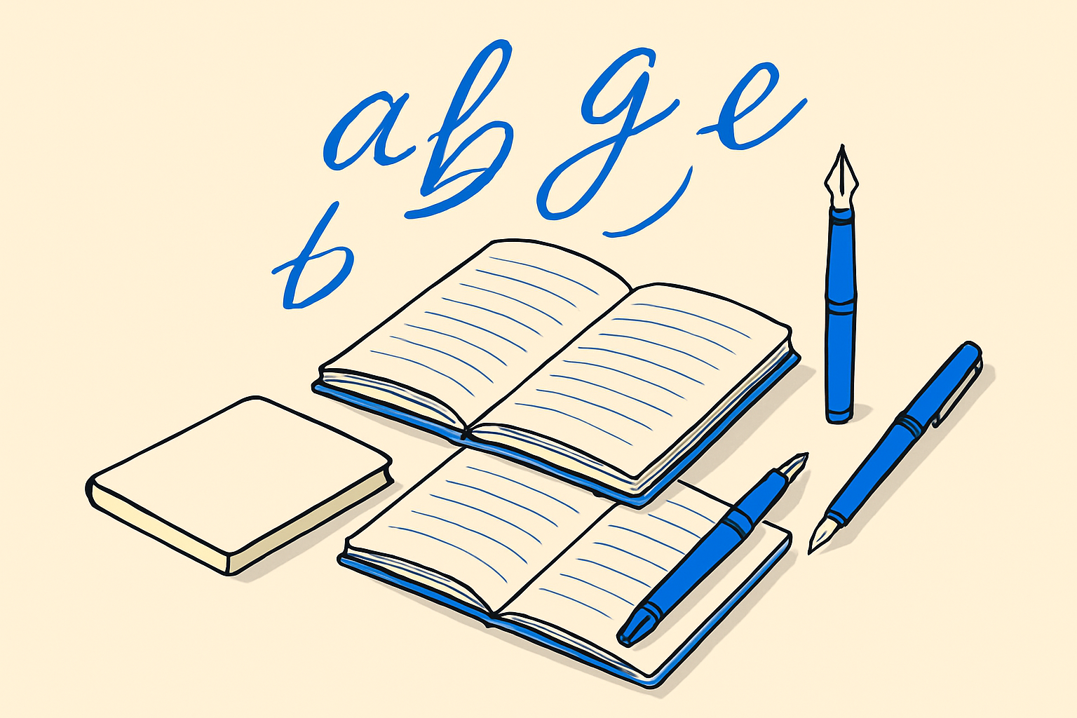
Handwriting fonts are easy to get wrong. Pick something too decorative and your UI becomes illegible. Pick something too stiff and it loses the warmth you were after. The fonts below are all free, all battle-tested, and each one has a specific context where it earns its place.
The Roundup at a Glance
- Dancing Script, polished script, great for headings and logos
- Caveat, casual and legible, best for annotation-style UI
- Pacifico, retro bold script, strong brand personality
- Satisfy, elegant but approachable, solid for subheadings
- Great Vibes, formal calligraphy, ideal for wedding or luxury contexts
- Kalam, handwritten print, excellent for body-length handwriting text
- Indie Flower, playful and airy, works well in creative or children's contexts
- Sacramento, thin monoline script, beautiful at large display sizes
- Allura, refined script with calligraphic roots, good for greeting cards
- Cookie, smooth and flowing, a clean alternative to Dancing Script
The Polished Scripts
Dancing Script is the one most designers reach for first, and for good reason. It has consistent rhythm, multiple weights, and reads clearly even at medium sizes. Use it for a restaurant logo, a section header, or a pull quote. Avoid it for anything under 18px.
Great Vibes goes further into formal territory. The letterforms have genuine calligraphic structure, so it fits invitations, luxury product packaging, or a wedding planner's website. It does not have multiple weights, so plan your typographic hierarchy around that constraint.
Allura sits in a similar lane as Great Vibes but with slightly more even spacing. If Great Vibes feels too ornate for your project, Allura is the next stop.
Sacramento is ultra-thin and monoline. It looks stunning at 80px on a hero section. At smaller sizes it breaks down fast, so treat it as a display-only choice.
Cookie has a flowing, almost casual elegance that makes it a cleaner alternative when Dancing Script feels too expected. Worth reaching for when you want script without the ubiquity.
The Casual and Readable Ones
Caveat is probably the most versatile font in this list for UI work. It reads like a real person wrote a note in the margin of a document. That quality makes it ideal for tooltips, annotation layers in SaaS dashboards, or any moment where you want a human touch without sacrificing legibility. It supports multiple weights, which is rare in this category.
Kalam is the go-to when you need handwriting that actually reads at body sizes. It is an Indian-script-informed Latin handwriting font, which gives it a distinctive rhythm. Use it for longer passages of handwritten-style text, educational platforms, or journaling apps. It holds up where most handwriting fonts collapse.
Indie Flower is loose and bubbly. It works in children's content, creative portfolios, or anywhere the vibe is deliberately unpretentious. Do not pair it with serious copy. The personality is strong and it will fight anything corporate.
The One with Brand Muscle
Pacifico is bold, round, and retro. It carries the energy of a 1950s surf shop sign, and that is both its strength and its limitation. When that personality fits, nothing else comes close. Think food trucks, lifestyle brands, summer campaigns. When it does not fit, it will look like a costume.
Satisfy is the understated option. It is elegant without being showy, which makes it easy to pair with a clean sans-serif. If you need a script that does not overpower a design, Satisfy earns that role.
Pairing Advice
Handwriting fonts almost never work well alongside another decorative font. Pair them with something neutral: Caveat with Inter, Dancing Script with a geometric sans like Nunito, Kalam with a humanist sans. The handwriting font is the personality. The supporting font is the structure.
Also keep in mind that handwriting fonts at small sizes are almost always a mistake. Set a floor of 16px for casual styles like Indie Flower and Caveat, and 24px or above for thin scripts like Sacramento and Great Vibes.
Performance Notes
All ten of these are available on Google Fonts, which means you can load them via a CDN with a single link element or use a tool to self-host a compressed subset. If you only need Latin characters and basic punctuation, subsetting can cut file size by 60 to 80 percent. That matters more with script fonts than with most other categories, because the glyph shapes are complex and file sizes run larger.
For variable font support, Caveat and Dancing Script both offer variable versions, which lets you control weight without loading multiple files. That is a meaningful win if performance is a priority.
The Short Answer
If you only download two fonts from this list, make it Caveat for UI work and Dancing Script for display and branding. They cover the widest range of real-world use cases without demanding too much from the designer or the reader.
Frequently asked
Are these handwriting fonts actually free for commercial use?
Yes. All ten fonts in this list are released under the SIL Open Font License, which permits commercial use including in products, client work, and digital downloads. Always confirm by checking the license file in the font package before shipping.
Which handwriting font is most legible at small sizes?
Kalam and Caveat are the strongest performers at smaller sizes. Both have generous x-heights and clear letterform spacing. Avoid thin scripts like Sacramento and Great Vibes below 24px because the strokes become too fine to read reliably.
Can I use handwriting fonts for body text?
Only Kalam is genuinely suited to body-length handwriting text. The others work at heading and display sizes. Using a decorative script for paragraphs creates fatigue quickly and can hurt accessibility for users with dyslexia.
How do I reduce the file size of a handwriting font?
Subset the font to include only the characters your project actually uses. For an English-only site, dropping unused Unicode ranges can cut the file by 60 to 80 percent. Tools like fontcompressor.com automate this process without requiring command-line work.
Which fonts in this list support variable font features?
Dancing Script and Caveat both have variable font versions available on Google Fonts. A variable font lets you pick any weight along a range with a single file, which reduces HTTP requests and total download size compared to loading separate weight files.